Visualization integrity
Before the class
- Read E. R. Tufte, Visual Display of Quantitative Information, Ch. 1 and 2 (see Canvas).
Learning outcomes
- You will be able to explain the history of visualization in a broad sense and in doing so will be able to appreciate the leap from concrete to abstract thinking in visualization
- You will be able to explain why it is very easy to fool with (or be fooled by) data visualizations and the common ways that visualizations deceive.
- You will be able to explain basic reasons why correlation does not mean causation.
- You will be able to explain the impact of the choice of scales.
- You will be able to explain the motivation behind Tufte's "lie factor"
- You will be able to list several ways to create good visualizations (or not to create bad visualizations).
If you want to know more
Seeing is believing
As our brain tries to integrate information from multiple sources and as our vision is a dominent sensory input, vision can interfere and dominate other sensory inputs. For instance, what you see can distort what you hear and it's called the McGurk Effect.

Probably more striking example is so-called rubber hand illusion.

Apparently, it is very easy to create an illusion that a crude rubber hand is yours.
Bad visualizations
There have been a lot of bad data visualizations from News media. They seem to decrease as data visualization is highlighted more and more. But still you will be able to find some glaring errors in data visualizations in news. For instance,
- WTF Visualizations
- The most misleading charts of 2015, fixed
- Flowing data: Ugly visualization
- Unemployment rate under president Obama
- Zika virus
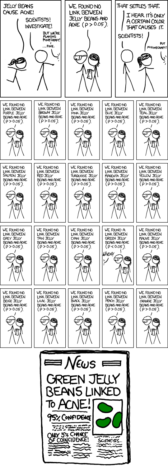
Correlation != causation

As this comic beautifully captured, the correlation does not guarantee causation, but the fact is usually not very intuitive to many people. First of all, if you have a lot of numbers, it is very easy to conjure spurious correlations.
On the following website, you can find really weird and hillarious correlations that do not make any sense.
And then, it is often not easy to realize the existence of potential confounding variables (factors). For instance, if there is a negative correlation between maternal mortality and births by C-sections, it is very easy to fall into a trap to think, "Oh, this indicates that C-section saves lives!" However, if number of C-sections in a country is strongly affected by the wealth of the country, and if the maternal mortality is also strongly affected by the wealth of the country, the negative correlation can be clearly visible even if C-section increases maternal mortality slightly!
With the power of visual images, it is easy to mislead people by showing strong correlation and arguing the existence of causality.
There are three kinds of lies: lies, damned lies, and statistics.
Although I believe that statistics is one of the best tools that we have to make informed decisions, it is still true that you can be fooled by hidden details. The following book explains how one can be fooled by statistics and statistical graphics. This book is concise, witty, and extremely useful!

The book talks about how you can manipulate perception by showing certain range of values for the vertical axis (mainly by not starting at zero). But it should not be followed religiously. The following video by Vox, titled Shut up about the y-axis. It shouldn’t always start at zero, explains this point nicely.